A discussion of the most commonly viewed pages on the CSU, Chico Web site.
This post is based on this analysis.
In some ways there is less to learn from the list of most viewed pages than there is from the most popular searches.
For one thing, many of these pages are buried deep within the hierarchy and are part of specific courses. Certainly, "Skull Model" (#14) and "Indian Caste System" (#17) are parts of very popular courses. The Skull Model has been around for years and has always been a highly viewed page.
One thing that is new is the rise of social networking pages, like "Progressive Students Union WIKI" (#2) and "Taiwanese Students Association" (#8, #19). Pages like these aren't part of the "official campus web presence" that is somewhat centrally maintained. So, though they are an important part of what is going on on campus, they aren't about to appear on the home page any time soon.
What's left is pretty much the usual suspects; library, class schedule, campus directory, catalog, etc. Student Computing is prominent, but that's because all of their labs computers use that as a home page.
There are a number of "deep link" pages in the top 30 most viewed pages. Some of these, like "Job Opportunities" (#21) are important enough to consider placing on the home page. However, most of the deep links can be reached via from the home page via a main page link (e.g., "Athletics - Baseball" can be reached from the "Athletics" link on the home page). The only real anomoly is the "Career Planning - Cover Letter Examples" page (#6). This page might have been used in a course or other activity, so without hard evidence I'd hesitate to consider placing a link to this on the home page.
Overall, based on the analysis, most of the bases are covered with respect to having the most viewed pages linked from the home page.
Thursday, November 30, 2006
So What's It All Mean? Part 1 - Search Terms
A discussion of what to do about the most commonly searched for terms on the CSU, Chico Web site.
I'm a big advocate of the school of thought that says that your most popular search term is your hardest to find page. In other words, if people prefer to browse first and search after a browse fails (see this post), then a large portion of searches are for things that they couldn't find via browsing.
So, what does that mean? Should we put big flashing links for campus map, transcripts, and financial aid on the home page?
Maybe it does.
These are obviously high demand pages and should have high visibility. Of the top 30 search terms, only eight had visible links on the home page (campus map, class schedule, athletics, bookstore, portal, Orion, library, and catalog).
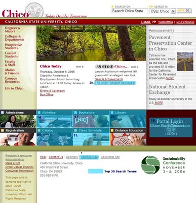
When you look at the placement of these eight links, you can see that all of them are either in the lower part of the page, or use very small text (or both in the case of "campus map").
Five of the links occur in the "photo/link" strip toward the bottom of the page, suggesting that perhaps this bar either is not highly visible or does not communicate effectively the fact that there are links there.
In any case, none of these links are prominently placed on the page, and this probably contributes to their popularity as search terms.
Another seven popular search terms appeared in the blue pop-up menus on the home page (financial aid, housing, jobs, academic calendar, records and registration, human resources, and associated students), indicating that the pop-up menus perhaps don't get as much use as we would like.
So overall 15 of the top 30 searches appear some place on the home page, but none of them have a high visibility.
Recommendations
I don't actually recommend big flashing links on the home page, but I do recommend that we take a closer look at who is doing the searching and whom the home page is serving.
A close look at who is likely doing the searching reveals the following about the top 57 search terms (based on this post):
| Likely Searchers | Terms | Percent |
| Current Student | 54 | 95% |
| Prospective Student | 20 | 35% |
| Community | 6 | 11% |
| Staff | 5 | 9% |
| Alumni | 3 | 5% |
| Faculty | 3 | 5% |
If, in fact, current students are likely to be searching for 54 of the top 57 terms, then I think it becomes clear that they are the major audience for our home page as it exists. It doesn't have to stay that way, of course. Humboldt State redesigned their home page to be a marketing tool for recruiting new students. That's great, but right now I think it's clear that current students are doing searches more than all other groups combined and would most benefit from a redeveloped home page.
IF the goal of the home page remains to serve current students, then a reorganization of the link structure to increase the visibility of the most popular search terms is an obvious idea.
How to do it?
Some campuses put a list of "Quick Links" on their home pages (University of Michigan, Princeton, for example); a list of supposedly popular links. But I'm not a fan of these for the same reason I'm not a fan of FAQ pages: it's an unorganized grab bag of stuff and there is no apparent reason for me to expect that what I'm looking for will be there. The "information scent" is too faint for me to want to go down that trail. In the case of the U Mich site, they at make them all visible (though they're in no discernible order).
Personally, I'm more of a fan of the approach that the University of Florida takes, which is to have main headings with a list of popular links below it, reminiscent of the old Yahoo! home page. Western Washington University does something similar. In fact, I suggested something similar during the last redesign in 2003:

What's the advantage?
The advantages of this approach IMO are:
- Links are part of a clear organizational structure (e.g., "campus map" could go under "About Chico State") instead of a haphazard list-o'-links.
- Links are plainly visible on the page without having to click on a "Quick Links" list or a pop-up menu.
The challenge is coming up with an organizational structure that includes as many of the high profile search terms as possible.
However, page structures like this have fallen out of favor in recent years, probably because people think that pop-up menus are more effective. This is certainly true from a space usage perspective, but I'm not actually convinced that this is the case from a findability perspective. My feeling is that pop-up menus are OK if the user knows they are there and if the menus are short and clear enough to be quickly scannable, but otherwise may actually reduce findability by making links on the home page less visible.
This is just one idea, and I'm sure that there are other ways to do this that present the links as part of an organized scheme and doesn't hide them in a drop-down list or pop-up menu somewhere.
Another Approach for Campus Map
The University of Wisconsin has put a link to their interactive campus map in a very prominent place on the home page, using an icon to draw attention. For something is as high demand as the campus map (and something that lends itself to a visual representation), this is not a bad approach. This wouldn't work for everything, of course, because the page would be littered with icons, but for the campus map (which is a perennial favorite), the idea has some merit and would make it clearly stand out.
Search vs. Browse
Insane babblings about why people use search instead of browsing, and visa versa.
Why do people use search instead of browsing or visa versa? We'll I'm sure that there are studies out detailing why, but I prefer to wing it based solely on opinion with no facts to support me. So here are my reasons why people prefer searching:
- They think it's quicker (but will try browsing if searching fails)
- They know exactly what they're looking for
- They don't trust (or have had a bad experience with) the site's browsing architecture
- They want to get instant results without a lot of steps (this is a combination of 1, 2, and 3)
Ultimately (particularly for a younger audience who are a) more web savvy, and b) want instant results without intermediary steps) searching is about getting to the desired information as quickly as possible without having to make decisions and without thinking about choices. This approach is referred as teleporting. Whether or not this is a good thing I'll leave to others to debate.
However, "The Perfect Search Engine Is Not Enough: A Study of Orienteering Behavior in Directed Search" (now I'm starting to do my research) suggests just the opposite, that people tend to browse first and search only when that fails, and that people tend to return to browsing (or "orienteering") even after a successful search.
One interesting paper (Effects of Scent and Breadth on Use of Site-Specific Search on E-Commerce Web Sites) found that the decision of a user to use search or browse approaches to finding information depended on several things, including:
- How clearly organized and labeled a site's menu system was ("information scent")
- How prominent search and browse areas were
- The user's inclination to search or browse
Here's an article that summarizes the two papers mentioned above - that I found only after I found the other two.
The Upshot
What's the upshot of all this for administrators and others trying to plan a new website?
My take on it is this: If it's true that people prefer to browse (I plan to test this hypothesis), then we need to make absolutely certain that our site structure is extremely clear, well-designed, intuitive and easy to use. As Katz and Byrne say, "providing site search should not be used to compensate for poor menu design, and provide[s] further evidence regarding the design of effective menu structures."
Let's face it, a perfect search engine would always give you exactly what you wanted the first time every time. If that happened, no site would even have a menu; they'd all look like the Google home page.
But search engines aren't perfect for several reasons (ambiguity of terms, lack of context, limited algorithms, and poor labeling being just a few). And if people prefer to use menu systems over search, it is a condemnation of the ability search engines to return desired results, because we all know how poorly organized most menu systems are.
People are choosing the lesser of two evils in this case. And though there are a few things we can do to improve search results, we have much less control over that than we do over the information architecture and menu systems of our sites.
References
Katz, M. A. and Byrne, M. D. (2003). Effects of Scent and Breadth on Use of Site-specific Search on E-Commerce Web Sites. ACM Transactions on Computer-Human Interaction, 10(3) pp 198-220. (Link)
Teevan, J., Alvarado, C., Ackerman, M. and Karger, D. (2004). The perfect Search Engine is not Enough: A Study of Orienteering Behavior in Directed Search. Proceedings of ACM CHI 2004, pp. 415-4422. (Link)
Wednesday, November 29, 2006
Home Page Structure of the Top 20 Sites
Analysis of the layout, structure and space usage on the top 20 university home pages.
I was curious as to what were the most common page elements on the top 20 sites. How many sites included news or events or welcome messages, as well as how many used left hand navigation vs. top navigation, etc. The following analysis breaks down my findings.
Most Common Page Elements
The "Average" Home Page
I was curious as to what were the most common page elements on the top 20 sites. How many sites included news or events or welcome messages, as well as how many used left hand navigation vs. top navigation, etc. The following analysis breaks down my findings.
Most Common Page Elements
| Element | Percent of Sites |
| Search Box | 100% |
| Photos | 100% |
| Top Banner | 90% |
| News | 85% |
| Copyright Notice | 75% |
| Left Navigation | 70% |
| Feature/Spotlight | 55% |
| Quick Links | 45% |
| Top Navigation | 35% |
| Contact Info | 30% |
| Events | 30% |
| Right Navigation | 15% |
| Inside "University" | 15% |
| Directory | 10% |
| Announcements | 10% |
| Calendar | 5% |
| Visit | 5% |
| Recruitment | 5% |
Surprisingly, a search box and photos were the only things that all 20 sites had on their home page. But maybe that's not so surprising given the difficulty in organizing something as complex as a university website.
Of course, all sites also had identity/branding that identified the university on the home page.
Content Analysis
In terms of actual content (as opposed to structural or navigational elements), there was less agreement among the 20 sites. Only two items - News and Feature/Spotlight occurred on more that 50% of the 20 home pages, and the majority of content types occurred on 10% or less of the sites.

| Element | Percent of Sites |
| News | 85% |
| Feature/Spotlight | 55% |
| Events | 30% |
| Inside "University" | 15% |
| Directory | 10% |
| Announcements | 10% |
| Calendar | 5% |
| Visit | 5% |
| Recruitment | 5% |
Page Element Placement
Another thing I was curious about was the placement of page elements on the page. I know that the issue of where to put the search box will inevitable arise, and I wanted to have hard data on what the "big boys" are doing.
Surprisingly, there were no real surprises. If you've read Neilsen, you realize that everybody is pretty much following the banner-on-the-top/navigation-on-the-left standard.
The following "heat maps" (OK, they're not heat maps in the traditional meaning) show where each of the most common page elements were placed on the page. To make these maps, I took a screen shot of each home page and then drew transparent rectangles over each page element. When I was done I removed the screenshots, leaving a stack of rectangles behind. Note that not every page was the same width, and I made the screenshots the size of the biggest page.
Top Banner
As expected, most sites use a top banner of varying heights, and most of them are placed - unbelievably enough - at the top of the page.
Identity/Branding
Here I'm only referring to the campus name and a logo or seal, if any. Some campuses put their logo in various places on the page, but almost all campuses put their name in the upper left part of the banner.
Search Box
Search boxes tend to be scattered around a bit more than the identity due to page layout considerations, but it's still clear that the most popular location is in the upper right-hand corner of the page.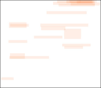
Navigation
Instead of trying to break down the navigation into different types, I just highlighted any area that was clearly navigational in nature. Many home pages had multiple navigation areas. Again, no surprise as the left side of pages and the area directly below the banner were the most popular locations for navigation.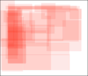 Photos
Photos are used to create interest and connection on a home page, humanizing the content by bringing people/and or the environment onto the page. Photos also add visual richness, whatever their content. Many sites use photos as part of features or spotlights on the home page, so there is considerable overlap in the placement of photos and the placement of features.
Again, not surprising, photos - with their attention-grabbing abilities - are most commonly prominently placed in the upper center of home pages. Many sites had photos in multiple areas of the home page, serving a variety of purposes.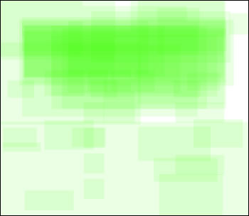
News/Announcements
News and announcements (mostly labeled "News") were the most common content element on home pages. Though there was no overwhelming consensus on the placement of News, the most common location was near the center of the page, or on the center left, just to the right of the navigation.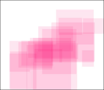
Feature/Spotlight
Features or spotlights are either short articles or article teasers placed on the home page, mostly highlighting some interesting or newsworthy aspect of the campus. For example, Cornell spotlighted a talk given by Shimon Peres; UW spotlighted sports stories and student research in ANWR.
Placement of Features varied widely, but was most concentrated in the center of the page, and closely follows the placement of photos, since virtually all Features were accompanied by photos.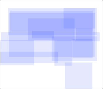
Events/Calendars
Events and/or calendars only appeared on about a third of home pages, but tended to all be placed lower center or lower right portion of the page.
Less than half of sites contained "Quick Links", typically as a drop-down list of links, but in a couple of cases as an actual list of links. The placement of Quick Links on the home page shows no discernible pattern.

The "Average" Home Page
On the "average" home page, 21% of the page area is taken up by photos, and 13% is taken up by navigation. Over a quarter of the page is taken up with white space or other content. The following graphic shows the relative average size of each content area, in proportion to each other and the page.
 The "Perfect" Home Page
Assuming that you wanted to build your home page based on the most common practices (which might or might not be a good idea), you would probably lay it out something like this:
Of course, this doesn't take into account the purpose of your home page, the primary intended audience(s) for your home page, your campus's particular branding, etc., etc.
Monday, November 27, 2006
Review of the Top 20 University Home Pages
Introduction to the analysis of the top 20 university home pages.
As part of the preparation for the redesign of the CSU, Chico home page, I decided to take a look at what other universities are doing on their home pages (following my personal mottos of "reinventing the wheel is for idiots" and "steal from those who actually know what they are doing").
Methodology
I conducted a simple Google search for "university" on November 27th, 2006, and took the first 20 sites that came up. I choose this approach because I didn't want to bias the results by selecting site that I personally liked, and because I felt that the top sites listed in Google would have a level of prestige and legitimacy that a truly random selection might not.
The top 20 sites were, in this order:
Use of Flash
As part of the preparation for the redesign of the CSU, Chico home page, I decided to take a look at what other universities are doing on their home pages (following my personal mottos of "reinventing the wheel is for idiots" and "steal from those who actually know what they are doing").
Methodology
I conducted a simple Google search for "university" on November 27th, 2006, and took the first 20 sites that came up. I choose this approach because I didn't want to bias the results by selecting site that I personally liked, and because I felt that the top sites listed in Google would have a level of prestige and legitimacy that a truly random selection might not.
The top 20 sites were, in this order:
- Harvard
- Stanford
- University of Florida
- University of Michigan
- Yale
- Cornell
- University of Delaware
- University of Washington
- Duke
- University of Texas at Austin
- University of Virginia
- Georgetown University
- Columbia University
- UC Berkeley
- Princeton
- Indiana University
- University of Pennsylvania
- University of Illinois at Urbana-Champaign
- University of Wisconsin - Madison
- New York University
I eliminated all sites with table-based layouts as being too old and non-standards compliant for consideration. This eliminated eight universities (highlighted in red, above). I then proceeded down the list of results in the Google search until I found the next eight CSS-based university home pages. I ended up looking at 45 university sites before finding 20 that were CSS-based, meaning that less than half of the top listed universities in the country have CSS-based home page layouts. The final list appears as follows:
- Stanford University
- University of Florida
- University of Michigan
- Yale University
- Cornell University
- University of Washington
- Duke University
- University of Texas at Austin
- Princeton University
- University of Illinois at Urbana-Champaign
- University of Wisconsin - Madison
- New York University
- Ohio State University
- Boston University
- University of Colorado at Boulder
- Florida State University
- Brown University
- University of Arizona
- Utah State University
- Syracuse University
I took a look at the DocType for each site and ran the W3C HTML validator and the Cynthia Says accessibility validator against each page. I also wanted to see the minimum width of each page (the point where content would be hidden and scrollbars would appear). Here's what I found:
| University | DocType | Validates | Sec 508 | Min Width |
| Stanford University | XHTML 1.0 Strict | Yes | Passed | 789 |
| University of Florida | XHTML 1.0 Transitional | Yes | Passed | 770 |
| University of Michigan | XHTML 1.0 Strict | Yes | Passed | 820 |
| Yale University | XHTML 1.0 Transitional | No | Failed | 783 |
| Cornell University | XHTML 1.0 Transitional | No | Passed | 809 |
| University of Washington | XHTML 1.0 Strict | Yes | Failed | 942 |
| Duke University | XHTML 1.0 Transitional | No | Failed | 718 |
| University of Texas at Austin | XHTML 1.0 Strict | Yes | Passed | 775 |
| Princeton University | XHTML 1.0 Transitional | Yes | Failed | 796 |
| University of Illinois at Urbana-Champaign | HTML 4.01 Transitional | No | Passed | 770 |
| University of Wisconsin - Madison | XHTML 1.0 Strict | Yes | Passed | 762 |
| New York University | XHTML 1.0 Strict | No | Failed | 815 |
| Ohio State University | HTML 4.01 Strict | No | Passed | 767 |
| Boston University | XHTML 1.0 Strict | Yes | Failed | 795 |
| University of Colorado at Boulder | HTML 4.01 Transitional | No | Failed | 765 |
| Florida State University | XHTML 1.1 | Yes | Passed | 797 |
| Brown University | XHTML 1.0 Strict | Yes | Passed | 765 |
| University of Arizona | XHTML 1.0 Transitional | No | Passed | 858 |
| Utah State University | XHTML 1.0 Transitional | Yes | Passed | 788 |
| Syracuse University | XHTML 1.0 Strict | No | Failed | 721 |
DocType
The most common DocType was XHTML 1.0 Strict, with nearly half of all sites using this DocType. Next most common was XHTML 1.0 Transitional, with 35% of sites.
Validation
Of the 20 home pages tested, only 11 (55%) actually validated, regardless of the DocType. Seven of the nine XHTML 1.0 Strict site validated, indicating that the people who maintain these sites are paying attention.
Section 508 Compliance
Only 12 (60%) of sites passed Cynthia Says automated accessibility validation. The most common problem was lack of labels on input elements.
Minimum Page Width
Minimum page width measures the smallest window width a page can viewed at before content begins to be obscured and horizontal scrollbars appear.
The narrowest page was 718 pixels wide (Duke); the widest was University of Washington at 942 pixels. The average minimum page width was 790 pixels, and the majority were between 760 and 800 pixels.
Use of Flash
Six of the 20 sites (30%) used Macromedia Flash technology on their home page. The most common uses were to provide rotating photos with stories and links and to provide pop-up menus. However, Boston University uses Flash to create an interactive recruiting environment with stories, photos, interactive maps, and multimedia pieces including video.
Wednesday, November 22, 2006
Most Popular Searches on the CSU, Chico Website
An analysis of the most commonly searched for terms on the CSU, Chico Web site, 2003 and 2006.
Part 4 in a series of analyses of the CSU, Chico home page and website that I conducted in 2003 and then repeated in 2006.
2003
2006
I repeated the analysis in 2006, the results of which are below.
Comparison
Summary
Key
stu = current students
ps = potential students
alm = alumni
fac = faculty
stf = staff
com = off-campus community
Part 4 in a series of analyses of the CSU, Chico home page and website that I conducted in 2003 and then repeated in 2006.
2003
Grouped and Ranked Search Terms
The following list groups similar search terms from the raw data. Terms such as "map", "campus map", and "map of campus" are grouped together to give a clearer picture of the true ranking of search terms.
| Rank | Term | Total | Percent |
| 1 | enter search term | 3132 | 4.81% |
| 2 | campus map | 1695 | 2.60% |
| 3 | portal | 1534 | 2.36% |
| 4 | financial aid | 1441 | 2.21% |
| 5 | as bookstore | 1047 | 1.61% |
| 6 | jobs | 1030 | 1.58% |
| 7 | transcripts | 818 | 1.26% |
| 8 | webct | 722 | 1.11% |
| 9 | athletics | 610 | 0.94% |
| 10 | housing | 574 | 0.88% |
| 11 | tracs | 469 | 0.72% |
| 12 | student employment | 447 | 0.69% |
| 13 | class schedule | 424 | 0.65% |
| 14 | tuition | 421 | 0.65% |
| 15 | 373 | 0.57% | |
| 16 | parking | 356 | 0.55% |
| 17 | orion | 354 | 0.54% |
| 18 | textlink | 287 | 0.44% |
| 19 | human resources | 239 | 0.37% |
| 20 | cave | 235 | 0.36% |
| 21 | grades | 209 | 0.32% |
| 22 | health center | 181 | 0.28% |
| 23 | calendar | 176 | 0.27% |
| 24 | wildcat card | 169 | 0.26% |
| 25 | study abroad | 167 | 0.26% |
| 26 | library | 161 | 0.25% |
| 27 | nursing | 156 | 0.24% |
| 28 | sororities | 151 | 0.23% |
| 29 | cns | 147 | 0.23% |
| 30 | career planning and placement center | 138 | 0.21% |
| 31 | academic calendar | 134 | 0.21% |
| 32 | celt | 133 | 0.20% |
| 33 | records and registration | 132 | 0.20% |
| 34 | associated students | 118 | 0.18% |
| 35 | user services | 116 | 0.18% |
| 36 | seo | 113 | 0.17% |
| 37 | writing center | 107 | 0.16% |
| 38 | sports | 101 | 0.16% |
| 39 | as presents | 94 | 0.14% |
| 40 | getting connected | 89 | 0.14% |
| 41 | work study | 87 | 0.13% |
| 42 | open classes | 82 | 0.13% |
| 43 | geography | 77 | 0.12% |
| 44 | address | 76 | 0.12% |
| 45 | application | 75 | 0.12% |
| 46 | open university | 73 | 0.11% |
| 47 | scholarships | 72 | 0.11% |
| 48 | regional and continuing education | 70 | 0.11% |
| 49 | directions | 68 | 0.10% |
| 50 | adventure outings | 65 | 0.10% |
| 51 | student computing | 65 | 0.10% |
| 52 | fraternities | 62 | 0.10% |
| 53 | catalog | 60 | 0.09% |
| 54 | syllabus | 59 | 0.09% |
| 55 | clubs | 57 | 0.09% |
| 56 | fall 2003 | 54 | 0.08% |
| 57 | whitney hall | 54 | 0.08% |
These statistics are very revealing.
First of all, they tell us that the link to the Portal is not seen by students, even though it is right next to the search box.
Further, they tell us that the lack of links to "financial aid" and "campus map" on the home page are a problem for many students. These would be prime additions to the home page in a redesign.
"Employment", "jobs", "human resources", etc., are also popular, indicating that links to jobs and employment might not be amiss on the home page. Many university sites do this, and a few even do it well.
Also, the fact that "enter search term" every other term says that consideration should be given to adding a single line of JavaScript code that would remove that text as soon as the user clicked in the search field.
2006
I repeated the analysis in 2006, the results of which are below.
| Rank | Search Term | Total | Percent |
| 1 | campus map | 6530 | 2.24% |
| 2 | transcripts | 5484 | 1.89% |
| 3 | financial aid | 4701 | 1.62% |
| 4 | housing | 4673 | 1.61% |
| 5 | jobs | 4384 | 1.51% |
| 6 | academic calendar | 3545 | 1.22% |
| 7 | webct | 3246 | 1.12% |
| 8 | tuition | 3144 | 1.08% |
| 9 | health center | 3039 | 1.04% |
| 10 | final exam schedule | 2881 | 0.99% |
| 11 | class schedule | 2870 | 0.99% |
| 12 | career planning and placement center | 2679 | 0.92% |
| 13 | calendar | 2661 | 0.91% |
| 14 | athletics | 2429 | 0.84% |
| 15 | as bookstore | 2235 | 0.77% |
| 16 | study abroad | 1994 | 0.69% |
| 17 | nursing | 1992 | 0.68% |
| 18 | summer orientation | 1956 | 0.67% |
| 19 | portal | 1929 | 0.66% |
| 20 | orion | 1802 | 0.62% |
| 21 | library | 1681 | 0.58% |
| 22 | graduation | 1668 | 0.57% |
| 23 | cave | 1572 | 0.54% |
| 24 | records and registration | 1529 | 0.53% |
| 25 | human resources | 1508 | 0.52% |
| 26 | student employment | 1486 | 0.51% |
| 27 | orientation | 1398 | 0.48% |
| 28 | parking | 1381 | 0.47% |
| 29 | as | 1294 | 0.44% |
| 30 | catalog | 1224 | 0.42% |
| 31 | general education | 1109 | 0.38% |
| 32 | add/drop | 1058 | 0.36% |
| 33 | eop | 1029 | 0.35% |
| 34 | badm 101 | 1018 | 0.35% |
| 35 | admissions | 970 | 0.33% |
| 36 | gpa calculator | 952 | 0.33% |
| 37 | theme | 877 | 0.30% |
| 38 | upward bound | 839 | 0.29% |
| 39 | photos | 755 | 0.26% |
| 40 | rec sports | 743 | 0.26% |
| 41 | geography | 722 | 0.25% |
| 42 | internship office | 700 | 0.24% |
| 43 | logo | 695 | 0.24% |
| 44 | peoplesoft | 686 | 0.24% |
| 45 | bmu | 645 | 0.22% |
| 46 | textlink | 595 | 0.20% |
| 47 | intramural sports | 591 | 0.20% |
| 48 | box office | 547 | 0.19% |
| 49 | facilities management services | 546 | 0.19% |
| 50 | psychology | 531 | 0.18% |
| 51 | commencement | 513 | 0.18% |
| 52 | research foundation | 512 | 0.18% |
| 53 | scholarships | 504 | 0.17% |
| 54 | university village | 504 | 0.17% |
| 55 | sap | 501 | 0.17% |
| 56 | regional and continuing education | 497 | 0.17% |
| 57 | baseball | 489 | 0.17% |
Comparison
Obviously, there were several changes in relative search popularity from 2003 to 2006, but no clear pattern is apparent.
Despite adding a link to Campus Map on the home page, "campus map" (or similar terms) is still the most popular search term. I attribute this to the fact that the link on the home page was essentially added as an afterthought in the footer of the page where it is not very visible.
The drop in "email" from 15th to 95th can probably be attributed to the change in the prominance of the email links on the home page. Similarly, the drop of "grades" from 21st to 87th is probably due to the fact that grades are easily accessible via the portal now, and most students are aware of that fact.
The biggest success story of the 2003 redesign was in adding a single line of JavaScript to the search box so that when a user clicked in the box, the words "enter search term" disappeared, resulting in removing "enter search term" from the top 100 search terms altogether.
The second biggest success story was changing the name of the link to the portal from "Chico State Connection" to "Portal", which is what everyone was calling it anyway. That moved searches for the portal from 2nd most popular to 19th.
Some unexplainable changes include the drop of "student employment" from 12th to 26th, the rise of "career planning and placement center" from 30th to 12th, the rise of academic calendar from 31st to 6th, the rise of "catalog" from 53rd to 30th, and drops in "user services", "sports", "getting connected", "work study", "open university", and several others.
| Rank 2003 | Rank 2006 | Term |
| 1 | enter search term | |
| 2 | 1 | campus map |
| 3 | 19 | portal |
| 4 | 3 | financial aid |
| 5 | 15 | as bookstore |
| 6 | 5 | jobs |
| 7 | 2 | transcripts |
| 8 | 7 | webct |
| 9 | 14 | athletics |
| 10 | 4 | housing |
| 11 | tracs | |
| 12 | 26 | student employment |
| 13 | 11 | class schedule |
| 14 | 8 | tuition |
| 15 | 95 | |
| 16 | 28 | parking |
| 17 | 20 | orion |
| 18 | 46 | textlink |
| 19 | 25 | human resources |
| 20 | 23 | cave |
| 21 | 87 | grades |
| 22 | 9 | health center |
| 23 | calendar | |
| 24 | 68 | wildcat card |
| 25 | 16 | study abroad |
| 26 | 21 | library |
| 27 | 17 | nursing |
| 28 | 63 | sororities |
| 29 | cns | |
| 30 | 12 | career planning and placement center |
| 31 | 6 | academic calendar |
| 32 | celt | |
| 33 | 24 | records and registration |
| 34 | 29 | associated students |
| 35 | 65 | user services |
| 36 | 59 | seo |
| 37 | writing center | |
| 38 | 58 | sports |
| 39 | 60 | as presents |
| 40 | 91 | getting connected |
| 41 | 80 | work study |
| 42 | open classes | |
| 43 | 41 | geography |
| 44 | 84 | address |
| 45 | application | |
| 46 | 93 | open university |
| 47 | 53 | scholarships |
| 48 | 56 | regional and continuing education |
| 49 | directions | |
| 50 | 62 | adventure outings |
| 51 | student computing | |
| 52 | fraternities | |
| 53 | 30 | catalog |
| 54 | syllabus | |
| 55 | 72 | clubs |
| 56 | fall 2003 | |
| 57 | whitney hall |
Summary
Overall, most terms that were popular in 2003 remained popular in 2006. Of the top ten terms in 2003, six were still in the top ten three years later.
Of the most popular search terms, virtually all of the top search terms appear to come from the current student audience group. Some terms (e.g., jobs, parking, financial aid, etc.) might also be used by other audience groups (community, staff, potential students, etc.), but it is impossible to separate those out accurately.
The table below gives a rough idea of the audience groups that would be most likely to use each search term. This is only my guesstimate, so you might have a different opinion.
| Rank | Search Term | Cur. Students | Pros. Students | Alumni | Faculty | Staff | Comm. |
| 1 | campus map | ||||||
| 2 | transcripts | ||||||
| 3 | financial aid | ||||||
| 4 | housing | ||||||
| 5 | jobs | ||||||
| 6 | academic calendar | ||||||
| 7 | webct | ||||||
| 8 | tuition | ||||||
| 9 | health center | ||||||
| 10 | final exam schedule | ||||||
| 11 | class schedule | ||||||
| 12 | career planning and placement center | ||||||
| 13 | calendar | ||||||
| 14 | athletics | ||||||
| 15 | as bookstore | ||||||
| 16 | study abroad | ||||||
| 17 | nursing | ||||||
| 18 | summer orientation | ||||||
| 19 | portal | ||||||
| 20 | orion | ||||||
| 21 | library | ||||||
| 22 | graduation | ||||||
| 23 | cave | ||||||
| 24 | records and registration | ||||||
| 25 | human resources | ||||||
| 26 | student employment | ||||||
| 27 | orientation | ||||||
| 28 | parking | ||||||
| 29 | as | ||||||
| 30 | catalog | ||||||
| 31 | general education | ||||||
| 32 | add/drop | ||||||
| 33 | eop | ||||||
| 34 | badm 101 | ||||||
| 35 | admissions | ||||||
| 36 | gpa calculator | ||||||
| 37 | theme | ||||||
| 38 | upward bound | ||||||
| 39 | photos | ||||||
| 40 | rec sports | ||||||
| 41 | geography | ||||||
| 42 | internship office | ||||||
| 43 | logo | ||||||
| 44 | peoplesoft | ||||||
| 45 | bmu | ||||||
| 46 | textlink | ||||||
| 47 | intramural sports | ||||||
| 48 | box office | ||||||
| 49 | facilities management services | ||||||
| 50 | psychology | ||||||
| 51 | commencement | ||||||
| 52 | research foundation | ||||||
| 53 | scholarships | ||||||
| 54 | university village | ||||||
| 55 | sap | ||||||
| 56 | regional and continuing education | ||||||
| 57 | baseball |
Key
stu = current students
ps = potential students
alm = alumni
fac = faculty
stf = staff
com = off-campus community
Subscribe to:
Posts (Atom)


