I was curious as to what were the most common page elements on the top 20 sites. How many sites included news or events or welcome messages, as well as how many used left hand navigation vs. top navigation, etc. The following analysis breaks down my findings.
Most Common Page Elements
| Element | Percent of Sites |
| Search Box | 100% |
| Photos | 100% |
| Top Banner | 90% |
| News | 85% |
| Copyright Notice | 75% |
| Left Navigation | 70% |
| Feature/Spotlight | 55% |
| Quick Links | 45% |
| Top Navigation | 35% |
| Contact Info | 30% |
| Events | 30% |
| Right Navigation | 15% |
| Inside "University" | 15% |
| Directory | 10% |
| Announcements | 10% |
| Calendar | 5% |
| Visit | 5% |
| Recruitment | 5% |
Surprisingly, a search box and photos were the only things that all 20 sites had on their home page. But maybe that's not so surprising given the difficulty in organizing something as complex as a university website.
Of course, all sites also had identity/branding that identified the university on the home page.
Content Analysis
In terms of actual content (as opposed to structural or navigational elements), there was less agreement among the 20 sites. Only two items - News and Feature/Spotlight occurred on more that 50% of the 20 home pages, and the majority of content types occurred on 10% or less of the sites.

| Element | Percent of Sites |
| News | 85% |
| Feature/Spotlight | 55% |
| Events | 30% |
| Inside "University" | 15% |
| Directory | 10% |
| Announcements | 10% |
| Calendar | 5% |
| Visit | 5% |
| Recruitment | 5% |
Page Element Placement
Another thing I was curious about was the placement of page elements on the page. I know that the issue of where to put the search box will inevitable arise, and I wanted to have hard data on what the "big boys" are doing.
Surprisingly, there were no real surprises. If you've read Neilsen, you realize that everybody is pretty much following the banner-on-the-top/navigation-on-the-left standard.
The following "heat maps" (OK, they're not heat maps in the traditional meaning) show where each of the most common page elements were placed on the page. To make these maps, I took a screen shot of each home page and then drew transparent rectangles over each page element. When I was done I removed the screenshots, leaving a stack of rectangles behind. Note that not every page was the same width, and I made the screenshots the size of the biggest page.
Top Banner
As expected, most sites use a top banner of varying heights, and most of them are placed - unbelievably enough - at the top of the page.
Identity/Branding
Here I'm only referring to the campus name and a logo or seal, if any. Some campuses put their logo in various places on the page, but almost all campuses put their name in the upper left part of the banner.
Search Box
Search boxes tend to be scattered around a bit more than the identity due to page layout considerations, but it's still clear that the most popular location is in the upper right-hand corner of the page.
Navigation
Instead of trying to break down the navigation into different types, I just highlighted any area that was clearly navigational in nature. Many home pages had multiple navigation areas. Again, no surprise as the left side of pages and the area directly below the banner were the most popular locations for navigation.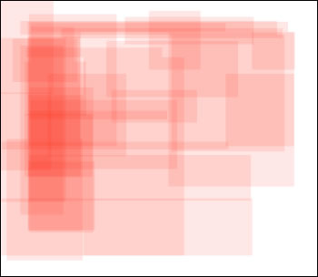 Photos
Photos are used to create interest and connection on a home page, humanizing the content by bringing people/and or the environment onto the page. Photos also add visual richness, whatever their content. Many sites use photos as part of features or spotlights on the home page, so there is considerable overlap in the placement of photos and the placement of features.
Again, not surprising, photos - with their attention-grabbing abilities - are most commonly prominently placed in the upper center of home pages. Many sites had photos in multiple areas of the home page, serving a variety of purposes.
News/Announcements
News and announcements (mostly labeled "News") were the most common content element on home pages. Though there was no overwhelming consensus on the placement of News, the most common location was near the center of the page, or on the center left, just to the right of the navigation.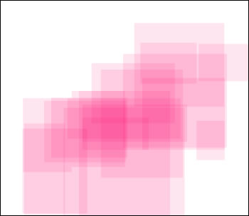
Feature/Spotlight
Features or spotlights are either short articles or article teasers placed on the home page, mostly highlighting some interesting or newsworthy aspect of the campus. For example, Cornell spotlighted a talk given by Shimon Peres; UW spotlighted sports stories and student research in ANWR.
Placement of Features varied widely, but was most concentrated in the center of the page, and closely follows the placement of photos, since virtually all Features were accompanied by photos.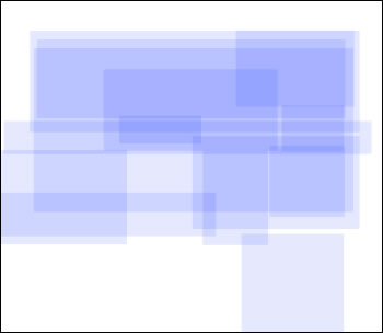
Events/Calendars
Events and/or calendars only appeared on about a third of home pages, but tended to all be placed lower center or lower right portion of the page.
Less than half of sites contained "Quick Links", typically as a drop-down list of links, but in a couple of cases as an actual list of links. The placement of Quick Links on the home page shows no discernible pattern.

The "Average" Home Page
On the "average" home page, 21% of the page area is taken up by photos, and 13% is taken up by navigation. Over a quarter of the page is taken up with white space or other content. The following graphic shows the relative average size of each content area, in proportion to each other and the page.
 The "Perfect" Home Page
Assuming that you wanted to build your home page based on the most common practices (which might or might not be a good idea), you would probably lay it out something like this:
Of course, this doesn't take into account the purpose of your home page, the primary intended audience(s) for your home page, your campus's particular branding, etc., etc.


2 comments:
Wondering what list the "top 20" that you analyzed came from. Media ranking? AAU? Something else?
Enjoyed the article. Clever way to compare how the schools placed their different sections.
Pam
Mays Business School
Texas A&M University
My methodology for selecting the top 20 sites can be found in this post
Post a Comment