Third is a series of analyses of the CSU, Chico home page, performed in 2003 and again in 2006.
2003
In his book Homepage Usability, Jakob Nielsen visually breaks down the home pages of major websites by how the space on the page is used.
I have done the same analysis with the Chico State homepage. Unlike commercial websites, there are no advertising or promotional items on the Chico State home page. The screen real estate usage on the home page is divided into four categories: Site Identity, Navigation, Content, Filler (which to Nielsen includes photos) and White Space.
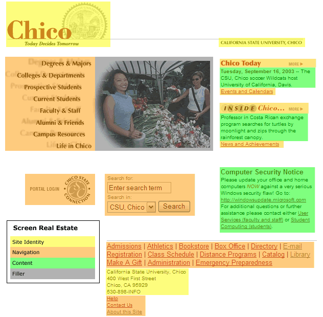
The chart, below, shows the percentage of the page taken up by each item. The most interesting thing to note is that nearly half of the page is taken up by white space.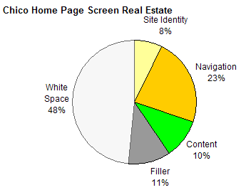
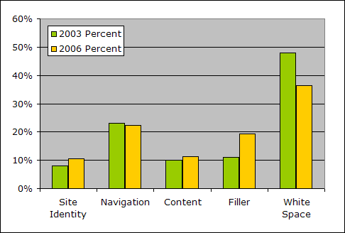
2006

One of the main purposes of the last redesign was to "add more photos" to the home page, and it shows in the increase of "filler" (using Nielsen's definition). The increase in filler came at the expense of white space on the page, which, at 48% was excessive.


No comments:
Post a Comment